
The various views of the Schedule have a lot of great information available to you. Some of the most pertinent information can be quickly conveyed by various coloring and shapes.
Field Update View
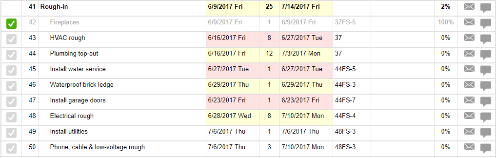
In the Field Update View, you might start seeing your tasks highlighted in yellow or red. Here's what that indicates:
Yellow: the task is currently underway according to its dates, or is upcoming. As a default, a task will start to show as upcoming when its start date is 5 days away. You can change the timeframe in which your tasks show as upcoming under your Personal Settings > Site Preferences.
Red: the task should have already been completed according to its dates. A task will show up as red as soon as its finish date has passed, and will remain red until marked as completed or until its dates are adjusted so it is no longer overdue.
Gantt View
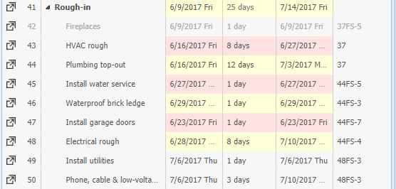
On the task list side of the Gantt view, you will also see the same highlighting of tasks in yellow or red for upcoming and overdue tasks respectively.
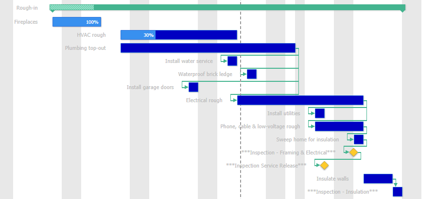
On the Gantt chart side we've got a lot of information packed in. Here's what you're seeing:
Green bar: these refer to parent tasks or "milestones" - tasks that have subtasks underneath them. In the example above, "Rough-in" is made up of many subtasks.
As the subtasks become completed, this green bar will get shaded to indicate how far along the whole phase is.
Blue bars: these are the individual, most drilled down tasks. The blue bar shows their duration, and the shading shows their completion percentage.
Yellow diamonds: these are individual tasks as well, but ones that have a 0 day duration. Their shape indicates that they do not have a real duration, but are more of quick tasks.
Green lines: these are predecessors, showing what kind of relationship a task has to other tasks.
Baseline View
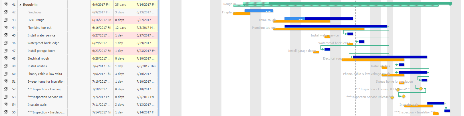
The Baseline View of the Schedule also shows a lot of the same information we have seen previously: the Upcoming and Overdue highlighting and the detail from the Gantt View. However, this view additionally contains more information on the Gantt chart side.
Orange bars: these bars represent what the individual tasks' dates and durations were when the baseline was set. They are placed directly below their corresponding actual tasks, so you can quickly see the differences.
For 0 day tasks and parent tasks, the baseline uses the same symbols and colors (though notice that the bar for the baseline of "Rough-in" is completely shaded).